
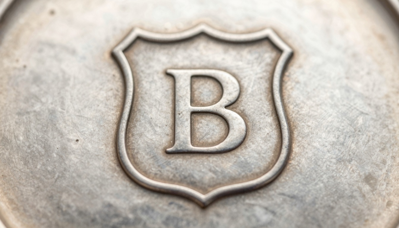
The date letter’s font and shield shape matter because together they fix a silver hallmark to one assay office and one exact year, not just a cycle.
What the date letter actually does
The date letter is the single stamped character that records the year a piece of silver was assayed. On a fully marked British piece it sits alongside the standard mark, the town mark, and the maker’s mark. One small letter carries the year.
A letter on its own is not enough to date anything. British assay offices ran their alphabets in cycles, usually around 20 to 25 letters, then started again. London’s letter “A” appears in 1736, in 1756, in 1776, and on through the centuries. The letter repeats; the year does not.
This is where font and shield shape do the real work. Each new cycle was struck in a deliberately different typeface and inside a deliberately different shield outline. A 1736 “A” is a Roman capital in a plain shield. A later “A” might be a black-letter capital in a shield with cut corners. Same letter, different decade, different punch.
Any seasoned collector knows the letter is only the headline. The font and the shield are the fine print that turn “sometime in a 25-year window” into a specific year. Skip them and you can misdate a piece by a full generation, which on a Georgian versus Victorian spoon is the difference between roughly $40 and $250.
Consider a lowercase Roman “d” on a London piece. That exact letterform sits in the 1779 cycle. A black-letter “d” with a different shield belongs to an earlier run entirely. The character is identical when you say it out loud, but the punch tells two different stories.
The practical takeaway is simple. Read the town mark first to fix the office, then read the date letter as a package: the letter, its case, its typeface, and the shield around it together. For a full walkthrough of locating every mark, our guide to identifying silver hallmarks covers the order in which to read them.
Why the font of the date letter matters
The font of the date letter is the assay office’s built-in anti-confusion system. Offices changed the typeface every cycle so that two “A” stamps from different decades could never be mistaken for each other.
London’s cycles show this clearly. The 1716 to 1735 run used Roman capitals. The 1736 to 1755 run switched to a smaller Roman face. The 1756 to 1775 run moved to Old English (black-letter) capitals. The 1776 to 1795 run used Roman lowercase. Each shift was intentional and documented.
This means the typeface alone often narrows a piece to one specific 25-year cycle before you have even checked the shield. A black-letter lowercase “g” cannot belong to a Roman-capital cycle. The letterform rules out every cycle that used a different style.
Font also separates the assay offices from each other. Birmingham, Sheffield, Chester, and Edinburgh each chose their own typefaces for the same calendar years. So a lowercase italic “m” struck in Chester looks nothing like the same year’s letter in Birmingham. The Victoria and Albert Museum’s hallmarking material at vam.ac.uk shows how varied these letterforms became across the country.
The trap is wear. A heavily polished letter loses its serifs and starts to look like a plainer face than it really is. A worn Old English “e” can read like a careless Roman “e”. When the font is ambiguous, you fall back on the shield shape and the surrounding marks rather than guessing.
Letter case is part of the font story too. Many offices alternated between uppercase and lowercase cycles. London’s “A” in one cycle is a capital; the next “A” run is lowercase. Case alone can move you 20 years.
A useful collector habit: photograph the letter straight on under raking light so the typeface stands proud. Serif shape, stroke weight, and case are far easier to judge from a sharp macro photo than from the piece tilted in your hand. For the letters specifically, our silver date letter hallmarks guide lays out the major cycles side by side.
Why the shield shape matters just as much
The shield shape, sometimes called the cartouche or escutcheon, is the outline of the punch surrounding the letter. It is not decoration. It is a second dating coordinate that works even when the letter is worn flat.
Assay offices changed the shield outline between cycles in step with the font. One cycle might sit in a plain shield with a pointed base. The next might use a shield with cut or chamfered corners, then a rectangle, then an oval, then a shape with a curved cusp at the top. The silhouette of the punch is as deliberate as the letter inside it.
This matters because the shield often survives wear better than fine serifs do. The deep outer edge of a punch holds its shape long after the delicate strokes of an Old English letter have rubbed away. On a worn salt spoon, the shield may be the only reliable clue left. The term cartouche itself, explained at Wikipedia, describes exactly this framed enclosure around a mark.
Here are the shield outlines you will meet most often and what each one signals:
| Shield outline | Common in | What it helps confirm |
|---|---|---|
| Plain shield, pointed base | Georgian cycles | Pairs with Roman or black-letter capitals |
| Shield with cut corners | Late Georgian to early Victorian | Narrows an ambiguous capital letter |
| Rectangle, chamfered corners | Victorian lowercase runs | Separates two similar lowercase cycles |
| Oval or oval-ended | Selected 19th-century cycles | Flags a specific office and decade |
| Cusped or curved-top shield | Later Victorian and Edwardian | Confirms a turn-of-century date |
The reader takeaway is to treat the shield as equal evidence, not background. When the letter and the shield agree on a cycle, you have a confident date. When they disagree, you have probably misread the office or you are looking at a later copy. Always cross-check the two before committing to a year.
Reading font and shield together: a worked example
Combining font and shield is how you move from “roughly Victorian” to “1865, Birmingham.” The two marks confirm each other, and that agreement is what makes a date trustworthy.
Start with a real puzzle. You have a teaspoon with a lowercase “k”. On its own, “k” could land in several different cycles across two centuries. So you do not start with the letter. You start with the town mark beside it.
Say the town mark is an anchor. That fixes Birmingham, and now you only consult Birmingham’s cycles, never London’s. This single step removes most of the wrong answers, because each office ran its own independent alphabet. Our silver hallmarks identification walkthrough explains why the town mark must always be read first.
Now bring in the font. Is the “k” a Roman lowercase with bracketed serifs, or a plainer sans face? In Birmingham’s 19th-century runs, the typeface separates the 1860s cycle from the 1880s cycle even though both used lowercase letters. The letterform alone narrows you to one 25-year block.
Finally, the shield. A shield with cut corners points to one cycle; a rectangle with chamfered corners points to the next. When the cut-corner shield agrees with the serif font, you land on the mid-1860s with confidence. A 1865 spoon and an 1885 spoon can look almost identical until the shield breaks the tie.
The value difference is real. A mid-Victorian Birmingham teaspoon by a known maker often trades around $30 to $60, while an earlier Georgian example of similar form can reach $120 or more. Getting the decade right changes the number on the tag.
The takeaway is a fixed order: town mark to choose the office, font to choose the cycle, shield to confirm the cycle, then the maker’s mark for the name. Work the marks as a system and the year falls out. Guess from the letter alone and you will be wrong more often than you think.
Not sure what you’ve got?
Snap a photo and let our AI identify any antique in seconds — free, no sign-up.
Identify on iPhone →Learn MoreDate letter cycles by assay office
Each British assay office ran its own date-letter cycle, with its own fonts and its own shield shapes. There was never one national alphabet. This is why the town mark must anchor every reading.
The offices started and reset their cycles in different years, so the same calendar year wears a different letter in each city. An 1875 piece is not marked with the same letter in London, Birmingham, and Sheffield. Confusing the cycles is the single most common dating error, and it is entirely avoidable once you fix the office first.
Here is how the principal offices compare:
| Assay office | Town mark | Cycle length | Note for daters |
|---|---|---|---|
| London | Leopard’s head | About 20 letters | Longest continuous record; richly documented |
| Birmingham | Anchor | 25 letters | Opened 1773; fonts shift clearly each cycle |
| Sheffield | Crown (rose after 1975) | 25 letters | Opened 1773; early letters out of sequence |
| Chester | Three wheatsheaves and sword | 20 to 26 letters | Closed 1962; useful for regional pieces |
| Edinburgh | Castle | 25 letters | Scottish standard; thistle added later |
| Glasgow | Tree, bird, bell, fish | 25 letters | Closed 1964; distinctive town mark |
Notice that the town marks are unmistakable once you know them, and they do the heavy lifting. The leopard’s head is London, the anchor is Birmingham, the crown is Sheffield. Reference works such as Kovels and printed hallmark guides reproduce each office’s full letter sequence year by year.
For London specifically, the letter, font, and shield together form a remarkably complete timeline back through the Georgian era. Our London silver date letters chart reproduces that sequence so you can match a letter directly to its year.
The takeaway is that the date letter is meaningless until you know which alphabet it belongs to. Read the town mark, choose the right office’s cycle, and only then interpret the font and shield. Treat the offices as separate systems, because that is exactly what they were.
Common mistakes when reading date letters
Most dating errors come from a handful of repeatable mistakes. Knowing them in advance is faster than learning them one ruined valuation at a time.
The first mistake is confusing the maker’s mark with the date letter. Maker’s marks are usually two or three initials in a single punch. The date letter is one character. A piece stamped “WB” is a maker, not a year. Read the punch count before anything else.
The second mistake is ignoring the shield. Collectors often match a letter and a font, feel satisfied, and stop. But two adjacent cycles can share a letter and a similar face, with only the shield shape separating them. Skip the shield and you can be 25 years out. The Metropolitan Museum’s silver holdings at metmuseum.org show how consistently the shaped cartouche was used as a dating element.
The third mistake is assuming every “A” or “a” is the same. The letter resets every cycle, so the same character recurs every couple of decades. Without the font and shield, an “A” tells you almost nothing on its own.
The fourth mistake is mistaking a duty mark for a date letter. Between 1784 and 1890, British silver carried the sovereign’s head to show duty had been paid. New collectors sometimes read that profile as part of the dating sequence. It is a separate mark with its own meaning, and our guide to date marks versus date letters untangles the two.
The fifth mistake is trusting marks on silver plate. Electroplate makers deliberately struck pseudo-hallmarks that mimic the look of real assay marks, including shield-shaped letters. These are not date letters at all. If there is no genuine standard mark, such as the lion passant or a millesimal number, treat any “date letter” with suspicion.
The takeaway is to slow down and read every mark in context. Count the characters, find the standard mark, fix the office, then read font and shield together. Most misdatings are not hard puzzles; they are simply rushed.
How to confirm a date letter fast
Once you understand why font and shield matter, confirming a date letter becomes a quick, repeatable routine rather than a research project.
Begin with a clean, straight-on photograph. Wipe the marks, hold the piece flat, and light it from the side so the punches cast tiny shadows. Raking light reveals serif shape, stroke weight, and the shield outline far better than flat overhead light. A sharp macro photo is worth more than a magnifier held at arm’s length.
Next, fix the office from the town mark, then open that office’s cycle and scan for your letter in the right case. Compare the font first, then the shield shape. When both agree on a cycle, you have your year. When they fight, recheck the office, because you have almost certainly matched the wrong city’s alphabet.
For speed, a phone-based identifier shortens the loop. You photograph the mark and it surfaces the likely office, era, and a value range in seconds, which is ideal at an estate sale when you cannot carry a shelf of reference books. It is a starting point, not a final verdict, but it gets you to the right cycle fast.
Always verify a surprising result against a printed or trusted online chart before you buy or sell on it. Apps and charts both make mistakes on worn or unusual marks, and a cross-check costs nothing.
The takeaway is that confident dating is a workflow, not a talent. Good light, the town mark first, font and shield read together, and a quick cross-check will date the overwhelming majority of British silver correctly. Build the habit once and it serves you on every piece you pick up.
Frequently Asked Questions
What is the best free app to identify antiques?
Antique Identifier – Antiqly is the best free app to identify antiques, including silver hallmarks, porcelain maker marks, and period furniture. It is a free download on iPhone with no sign-up required, so you can photograph a mark and get a result in seconds. Its strengths are hallmark reading, porcelain and pottery brand recognition, period dating, and an instant value estimate. For date letters specifically, it points you to the likely assay office and era, which is exactly the starting point you need before confirming the font and shield against a reference chart.
Why does the same date letter appear on silver from different years?
British assay offices ran their alphabets in cycles of roughly 20 to 25 letters, then reset to the start. London’s letter A appears in 1736, 1756, 1776, and onward, because the sequence repeats every cycle. The year is not encoded by the letter alone. It is encoded by the combination of the letter, its typeface, its case, and the shield shape around it. Each new cycle used a deliberately different font and shield so that two A stamps from different decades could never be confused. That is precisely why font and shield matter as much as the letter itself.
How do I tell which assay office a date letter belongs to?
Read the town mark next to the date letter before anything else. Each British office used an unmistakable symbol: the leopard’s head for London, the anchor for Birmingham, the crown for Sheffield, the castle for Edinburgh, and three wheatsheaves with a sword for Chester. Once the town mark fixes the office, you consult only that office’s cycle, because every office ran an independent alphabet with its own fonts and shields. Skipping this step is the most common dating error. An 1875 piece carries a different letter in London than in Birmingham, so the office must be settled first.
Can a worn date letter still be dated accurately?
Often yes, because the shield shape usually survives wear better than fine serifs. The deep outer edge of a punch holds its outline long after the delicate strokes of an Old English letter have polished away. On a heavily used salt spoon, the shield may be the only reliable dating clue left. Combine the surviving shield outline with the town mark, the standard mark, and any visible stroke of the letter to narrow the cycle. A trusted chart or a quick app scan can confirm the likely era, though badly rubbed marks may only date to a cycle rather than a single year.
Does the shield shape change within a single 25-year cycle?
Generally the shield outline stays consistent throughout one cycle and changes when the next cycle begins. That stability is what makes the shield useful, because a given shape reliably signals one cycle rather than fluctuating year to year. The letter inside advances each year while the surrounding shield holds steady, then both the font and the shield switch together at the cycle reset. There are occasional exceptions and special marks, such as commemorative or jubilee additions, but for routine dating you can treat the shield as a fixed property of the cycle and use it to separate two otherwise similar letter runs.
What is the difference between the date letter and the maker’s mark?
The date letter is a single character that records the assay year, struck inside a shaped shield and changing its font each cycle. The maker’s mark is the silversmith’s identifier, usually two or three initials in one punch, and it stays the same across all the years that maker was registered. Counting the characters is the quickest way to tell them apart: one letter is the date, a cluster of initials is the maker. They sit side by side on a fully marked piece, alongside the standard mark and the town mark, and each answers a different question about the object.
Identify any antique in seconds.
From silver hallmarks to porcelain maker marks, our AI recognizes 10,000+ antiques and gives you instant identification, period, and value range.
Download Free on iPhoneSee How It Works